A Brand That Leads: The DQM Logo Redesign
Project Overview
Sometimes the biggest breakthroughs happen when someone inside the industry sees the problem more clearly than the rest.
That’s how DQM got its start—a spinoff of a trucking compliance company that realized there had to be a better way to handle driver file compliance. For decades, the trucking industry had been stuck in paper files, manual spreadsheets, and systems that were long overdue for an update. DQM set out to change that with a new kind of SaaS platform: digital-first, smart, seamless—and most of all, easy to use.
But there was one problem.
Their brand—the first impression, the signal of trust and clarity—was still stuck in the same decade as the companies they were trying to help. The original logo wasn’t just outdated visually; it didn’t reflect the future-facing mindset DQM had built into their product. And in a space where trust is earned slowly and transformation feels risky, that matters.
Brand for Trust
At Three29, we believe a brand is more than a logo—it’s a feeling. And the feeling DQM’s identity gave off was a little too close to the very systems they were trying to replace.
So we set out to create a brand that felt like a gentle hand forward. One that said: Follow us. We know a better way. But without leaving anyone behind. It had to be tech-forward but still friendly.
We had to walk a fine line—elevating the brand to signal innovation and leadership while keeping it grounded and human enough to feel approachable and trustworthy. Most of DQM’s audience had seen a computer, maybe even used cloud software, but were still deeply immersed in analog systems. There was still a lot of trust that needed to be established.
Trust is first built with marketing and then continues through the sales process. Our job was to build that trust—with design.
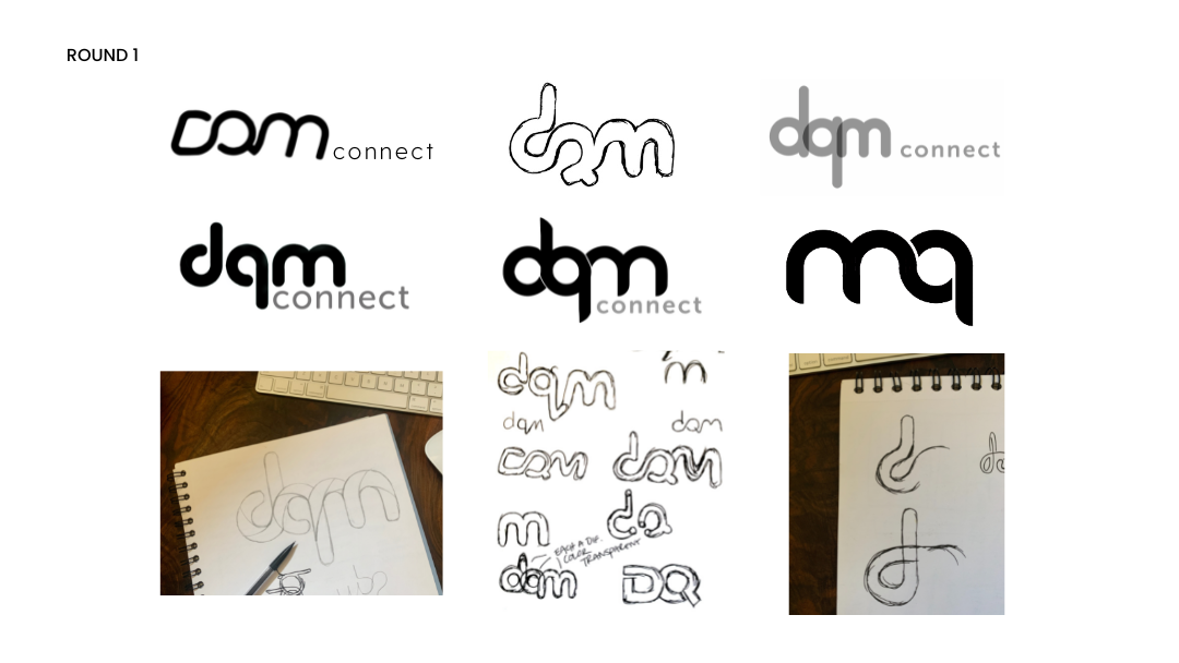
Phase 1: A Visual Language of Connection
In the early stages, we explored several logo concepts that embodied the values of DQM’s product: clarity, connectivity, and effortlessness. We leaned into lowercase letterforms to communicate friendliness and accessibility—no intimidating corporate speak, just a helpful partner.
From the start, the idea of connection guided the process. DQM’s platform ties together all the messy, paper-heavy threads of compliance and makes them flow seamlessly. We wanted the logo to mirror that same experience: unified, smooth, intuitive.
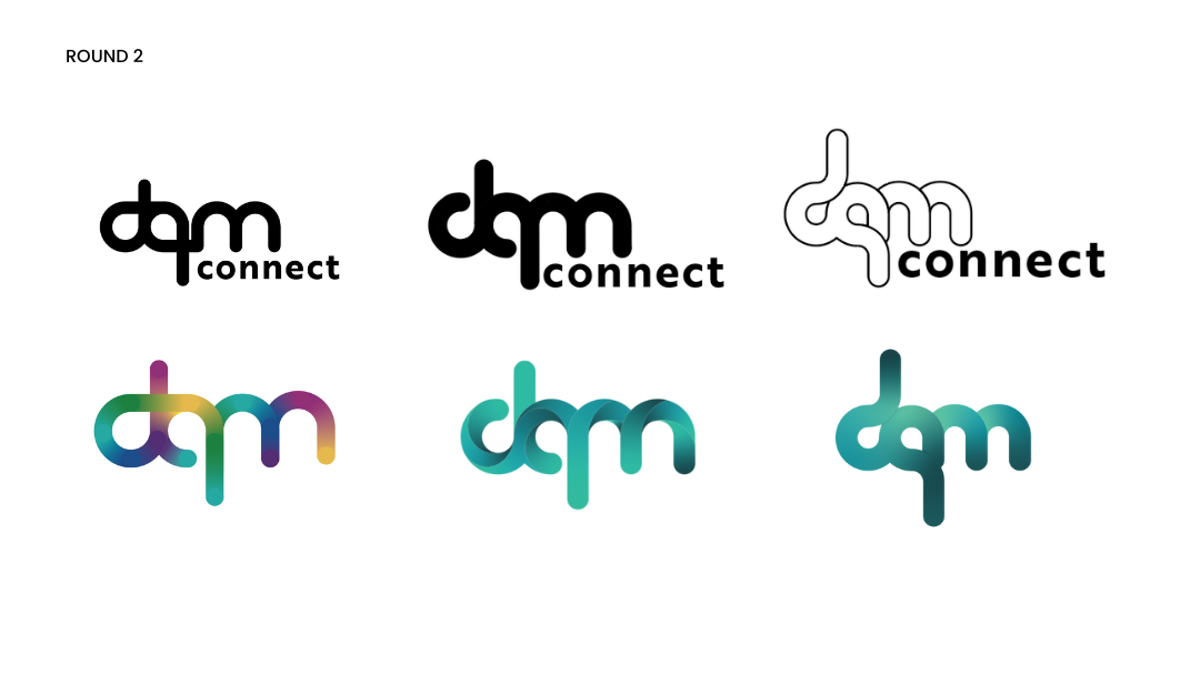
Phase 2: Iteration with Intent
The second round of designs brought that clarity to life. We tested color palettes that ranged from bold rainbows to calming blues and greens, always keeping the client’s core values and audience top of mind. The final design—three lowercase letters (“dqm”) woven together—landed perfectly.
It captured the spirit of modern software: smart and smooth, but never cold. The green tones offered a subtle nod to the brand’s past while planting a flag for where they were going next—as a trusted and intelligent partner. It was forward without being foreign.
We kept the lettering lowercase to reinforce approachability—a softer entry point into a more sophisticated solution.
A Mark That Moves People
In the end, the new DQM logo does more than look good—it leads.
In the end, the new DQM logo does more than look good—it leads. It carries the essence of the product and the promise behind the company. It speaks to the trucking companies still stuck in the shuffle of paper files and manual systems and says: This is what trust in technology can look like.
For SaaS companies in similar spaces—especially those trying to move legacy industries into the future—DQM’s journey is a great reminder: your brand isn’t just what you say, it’s how you make people feel.
And when the people you’re trying to help still live and work with outdated systems and tech, your SaaS brand needs to be the one brave enough to show them what’s next.
Thinking About a Brand Refresh?
If you’re building a SaaS brand that needs to lead with trust, we’d love to help you design the kind of identity that earns it.