See the best practices for landing pages in action with our before and after design.
A landing page is a single web page that appears in response to interaction with an ad, promotion, or email. The goal of a landing page is to get the visitor to take action! This goal action might be to click-through to elsewhere on the site, enter information that will be collected as a lead, call your business, or make a purchase among countless others.
No matter the product or service, building a landing page that converts is like following a recipe, and if you include all of the ingredients in the recipe it will come out perfect every time. Below are simple steps to optimizing a landing page and a before and after so you can see the difference.
Design landing pages with content that correlates with the audience’s journey and state of mind when they clicked through to view it.
One of the first things to consider when creating a new landing page is that you’ll want to design your landing pages based on where the user is coming from.
Landing pages that feel familiar and connect with your target audience will be more likely to convert that audience into engaged buyers, and will also lower your bounce rate.
For example, if a user is visiting your site from a post on Instagram or TikTok, you may consider using hero shots of people or language that was also used on the referring post. The landing page should feel “social” and familiar to the reason they chose to visit it in the first place. Or, let’s say the Google Ads keyword you are bidding on is descriptive like “healthy,” you may want to use images and designs that reflect that keyword.
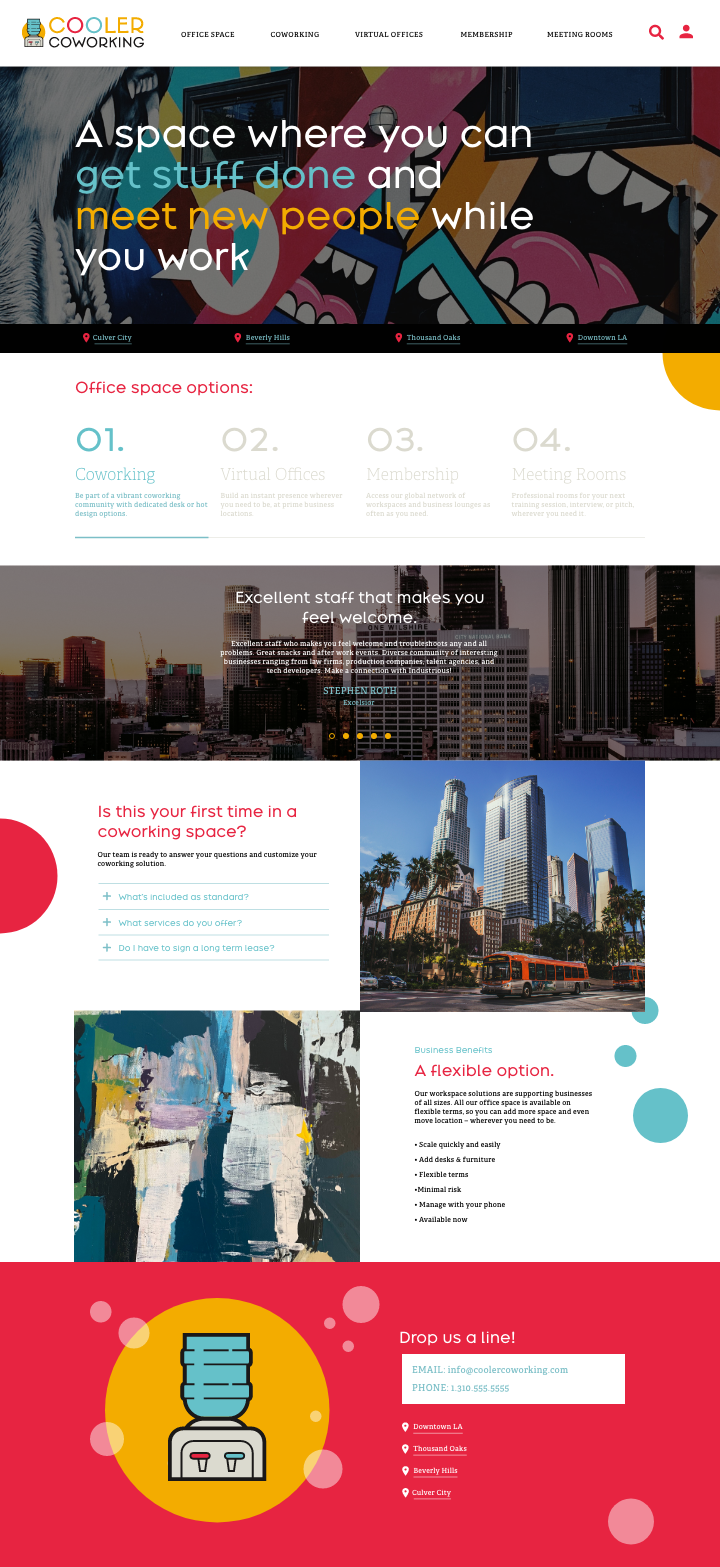
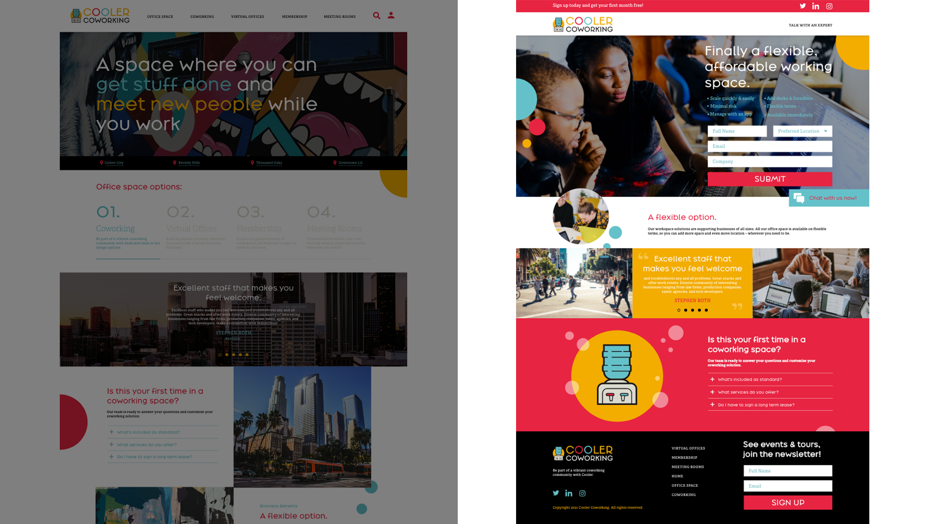
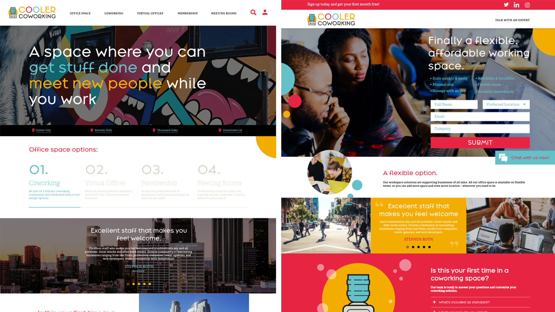
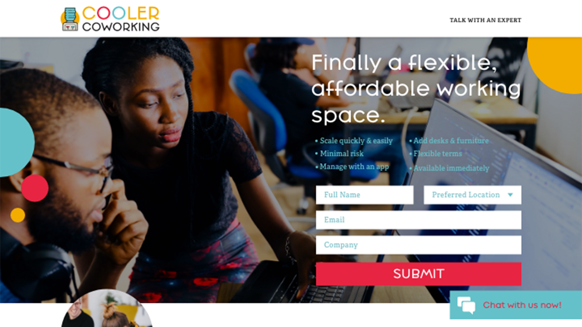
In the side-by-side comparison below, notice how the example landing page on the right is super bright and colorful. It also uses huge images of people. This is how a landing page where the user comes from social media, like Pinterest, should look. While the white space on the left is nice, it doesn’t have the same image-heavy feel and when there is misalignment with the user journey, so the conversion rate suffers.
Keep messaging and design in alignment with the overarching conversion goal of your landing page.
Design and marketing should be constantly collaborating so the imagery and messaging is on track with the goal of the business. Letting one department lead too much might cost you conversion.
While the design team may love the murals in LA as imagery for this LA coworking space, imagery of people will lead to higher conversion and makes more sense for the user.
Clear navigation, organization, and calls to action are paramount when designing a successful landing page.
Now, onto the actual design. Let’s start with the navigation. For a landing page, the navigation should be simple and contain a CTA. Paring down your original site’s landing page will allow the user to focus on the content you have direct them to and make a conversion more likely.
Next, consider the heading. Visuals, both imagery and video, convert better.
Boost your conversion rates by adding these tried and true ingredients to your landing page.
Landing Page Headlines:
- Headlines should be extremely large
- Headlines should contain 6-8 words max. People skim and keeping it brief ensures your message makes it to the user.
- The text in the headline should solve the user’s problem. In the case below, instead of stating what the company does, we adjusted it reflect the needs of the user.
Landing Page Calls-To-Action (CTAs)
- The primary Call-to-action should easy to find and easy to fill so it is driving conversion, too.
- It can be tempting to use a CTA in every module, but don’t use too many! It’s distracting and lengthens the page. A good landing page should be short and the message, focused.
- For CTA text, use directives. Use “shop”, “sign up” and not “learn”, “discover”
Above The Fold on Landing Pages
- In our landing page example, we focused on messaging that capture features and benefits that would connect with our audience. In what ways will your product or service make life better for your audience? The answer to this question should be above the fold on your landing page. This is because the answer to this question is the most appealing way to marketing when it comes to capturing conversions.
- Other?
Below or at the Fold on Landing Pages:
- This is a great place to use trust signals; Trust signals are things like reviews, partners, clients, and company statistics that convey features, benefits and reliability. This makes the user feel confident about converting.
A/B Testing is an integral part of getting your desired conversion rate.
It would be difficult to create the perfect solution the first time around. We suggest A/B testing to optimize over time to get the best results.
Two options when it comes to AB testing: Testing one difference vs a ton of changes at once.
Testing one difference gives you more control, less design work. You can make small changes to your page, see how the changes perform and optimize over time.
A completely new page with tons of changes easier and quicker to implement and get results, conversion reasons are less apparent, but there will be a clear “winner” allowing you to make a simple decision.
Other landing page best practices
Alt Tags Describe image content or what the image is illustrating conceptually in a simple way, no caps, dashes to separate the words. This will help SEO and ADA.
Page loading Keep it low. Use compressed images. https://moz.com/learn/seo/page-speed
Link blogs and articles but don’t forget to link back to the landing page.
Use a chatbot plugin. This increases time on site and makes the user feel like the site is more secure and your customer service is attentive.
Our Conclusion on Landing Pages
By following these simple guidelines you will arrive and a landing page that is performing well, and by AB testing, you can optimize the results even further. These tested elements brought together will not only give you insight into your user journey, but a better conversion rate too. See the full before and after below.
If you’d like Three29 to build you landing page we can take your marketing to the next level and implement customized versions of the tips above to compliment your business needs.