A website’s success hinges on its ability to engage and convert visitors to take action. One of the critical components driving this engagement is the call to action (CTA).
With three simple and effective improvements to your CTAs (that you can do yourself), you can increase your engagement and conversion rate, see more leads and sales, and grow your business.
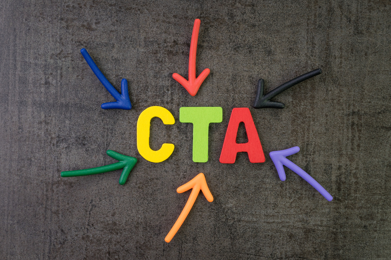
CTAs – What They Are & Why They Matter
A CTA is an invitation extended to your audience prompting them to take a specific action. This could be:
- Making a purchase
- Subscribing to a newsletter
- Filling out a lead capture form
- Downloading valuable content
CTAs can take the form of a button, a link, a popup, images, or even simple text.
The importance of a well-crafted CTA cannot be overstated. It serves as the virtual handshake between your brand and potential customers, guiding them toward your desired outcome.
However, creating an effective CTA involves more than just choosing compelling words. It requires a strategic approach, which is where A/B testing comes into play.
A/B testing involves experimenting with variations of your CTAs to determine which elements resonate best with your audience.
In this blog, we’ll delve into three crucial aspects of CTAs that you can test to optimize your website’s conversion rates: color, size, and button text. Let’s explore each of these elements and discover how they can collectively enhance the performance of your calls to action.
Color – Brighter Buttons and the Psychology Behind Conversions
In web design, the color palette you choose for your CTA buttons can significantly impact user engagement and conversion rates. Research suggests that brighter buttons tend to convert better, capturing the attention of visitors and guiding them toward the desired action.
1. Stop in Your Tracks: The Power of Red
Regarding color psychology, red is often associated with urgency and importance. It serves as a stop sign for the eyes, demanding attention and prompting immediate action. Implementing red in your CTA buttons can create a sense of urgency, encouraging visitors to act swiftly. It also demands center stage, capturing the attention of your audience immediately.

2. Green for Go: Encouraging Click-Throughs
Conversely, green is often associated with positivity and “go” signals. Utilizing green in your CTA buttons can evoke a sense of approval and encourage users to proceed, making it an effective choice for buttons that lead to positive actions such as “Buy Now” or “Sign Up.” It’s important when utilizing green to make sure it has enough contrast with the rest of your website colors to stand out.

3. Memorable Distinction: Setting Yourself Apart
Human beings are wired to remember colors before anything else. In a sea of websites, having a color that stands out can make your site more memorable. Consider the color palette of your competitors and choose a shade that differentiates your brand, creating a visual identity that sticks in the minds of your audience.

A/B testing different color variations of your CTA buttons allows you to discern which hues resonate most effectively with your target audience. Remember, the goal is not just to choose a color that looks aesthetically pleasing, but one that aligns with your brand personality and prompts the desired user response.
Next, let’s move on to the second element: Size. How can the size of a CTA button impact user engagement and conversions?
Size – Bigger Buttons on Your Site are Better, But Beware of Overkill
In the realm of CTA optimization, the size of your buttons can play a pivotal role in capturing user attention and driving conversions. While the mantra “bigger is better” holds true to a certain extent, it’s essential to strike a balance between prominence and subtlety to avoid overwhelming your audience.
1. Bigger Commands Attention
Research consistently indicates that larger buttons tend to capture more attention and generate higher conversion rates. A well-sized button stands out on the page, making it more likely for users to notice and interact with it. Users are more likely to follow through when they can easily spot the action you want them to take.


2. Buttons vs. Text Links
In the world of CTA optimization, buttons generally outperform text links. The tactile nature of a button creates a more clickable and interactive experience for users. It provides a clear visual cue, making it easier for visitors to understand where to click and what action to take.

3. Consistency Matters
While experimenting with button sizes, it’s crucial to maintain a level of consistency across your website. Consistent button sizes create a sense of harmony in your design, reinforcing the visual hierarchy and helping users navigate your site seamlessly. Users should be able to recognize and understand your CTAs easily, regardless of the page they’re on.

4. Caution: Avoid CTA Overload
While larger buttons can be more effective, it’s important to exercise restraint. Placing buttons everywhere can lead to visual clutter and, paradoxically, make them less noticeable. Consider the context of each CTA and strategically choose where to place larger buttons to maximize impact without overwhelming your users.

As you embark on A/B testing different button sizes, pay attention to user feedback and behavior. Strive for a balance that ensures your CTAs are prominent and easy to interact with, without compromising the overall user experience.
Now, let’s move on to the third element: Button Text. How can the words on your CTA buttons influence user behavior and drive conversions?
Button Text – Crafting Compelling Calls to Action
The text on your CTA buttons is more than just a string of words; it’s a powerful tool that can either entice or deter users from taking the desired action. The choice of words can influence user expectations and shape their experience on your website. Let’s explore how crafting compelling button text can enhance user engagement and drive conversions.
1. Clarity Through Verbs
When it comes to button text, clarity is paramount. Avoid vague phrases like “Learn More” that don’t provide a clear indication of what the user can expect. Instead, opt for action-oriented verbs that explicitly communicate the intended outcome. For instance, using phrases like “Shop Now,” “Download Ebook,” or “Subscribe Today” gives users a clear idea of the action they’re about to take.

2. Removing Barriers to Entry
Consider using button text to address potential concerns or hesitations users may have. For example, if you’re encouraging users to register for a service, saying “Register Now, it’s Free” removes the barrier of cost and reassures users that there’s no financial commitment involved. This transparency can significantly increase the likelihood of users clicking on the button.

3. Urgency and FOMO
Incorporating a sense of urgency or fear of missing out (FOMO) in your button text can also spur action. Phrases like “Limited-Time Offer” or “Exclusive Access” create a sense of immediacy, encouraging users to act quickly to secure the perceived benefits.

4. Personalization and Relevance
Tailor your button text to your target audience and make it relevant to their needs or desires. Personalized and empathetic language can create a connection, making users more inclined to engage. For example, instead of a generic “Sign Up,” consider “Join Our Community” for a social platform.
5. A/B Testing for Optimization
As with color and size, A/B testing different iterations of button text is essential. Test variations that play with wording, tone, and length to understand what resonates best with your specific audience. Analyzing user behavior and conversion rates will guide you toward the most effective button text for your CTAs.


By carefully choosing your button text, you can guide users through a seamless journey, ensuring they understand the value of the action and feel compelled to click.
Crafting the Perfect CTAs is a Mix of Strategy, Measurement & Refinement
It’s important to remember that this is a dynamic process that involves strategic adjustments in color, size, and button text. By delving into the psychology behind color choices, exploring the impact of button sizes on user engagement, and crafting compelling text that speaks directly to your audience, you have the tools to elevate your website’s performance.
The goal is not just to create visually appealing CTAs but to guide users seamlessly toward desired actions. Through A/B testing and continuous refinement, you can achieve a website that not only captures attention but also converts visitors into valuable leads and customers.
Implement these three DIY improvements, and watch your website become a powerful tool for business growth.