Where we came from
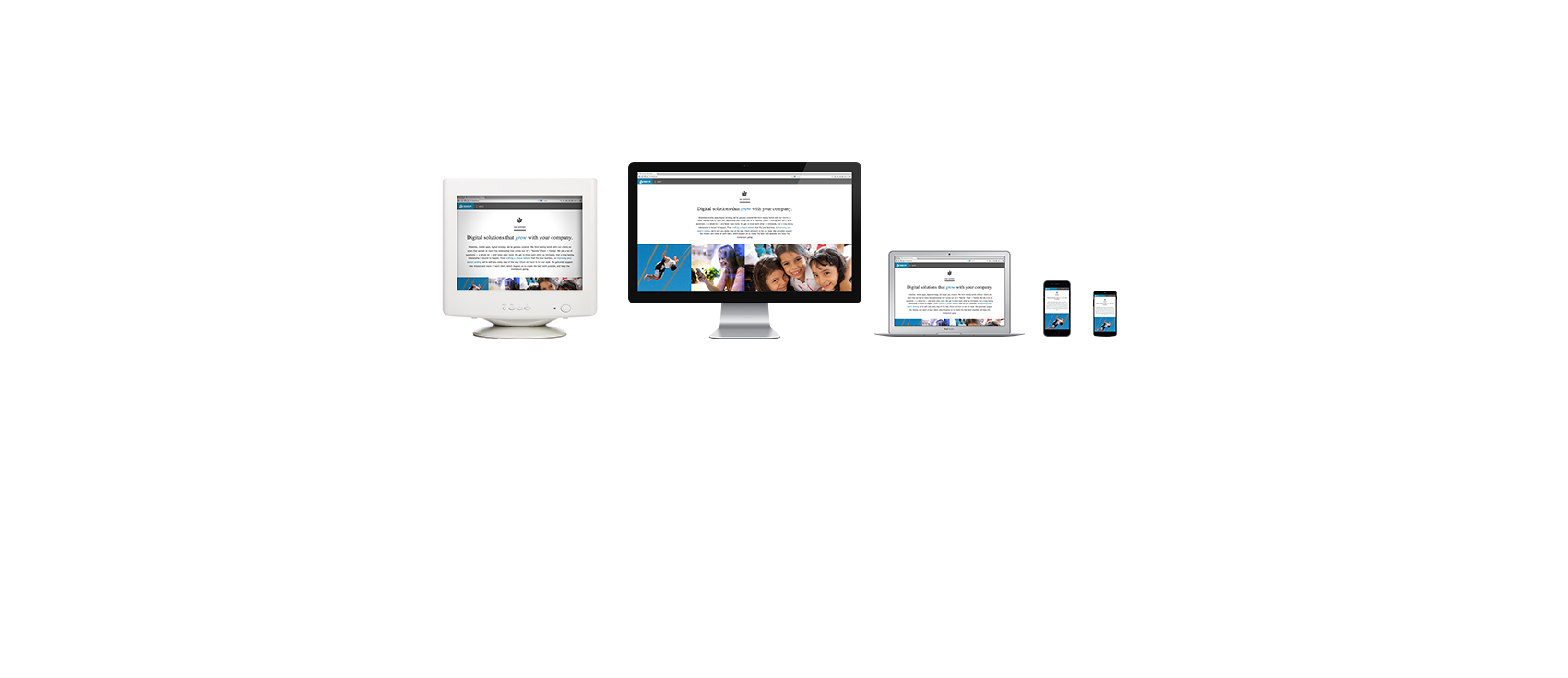
In years past companies would maintain a desktop website and a separate, smaller, mobile website. This meant that most of the time the mobile site had to be updated separately, that it didn’t use the same content, images or even database. A simple update to a phone number had to be done on the desktop site, then on the mobile site again. To say the least, it was tedious.
Where we are
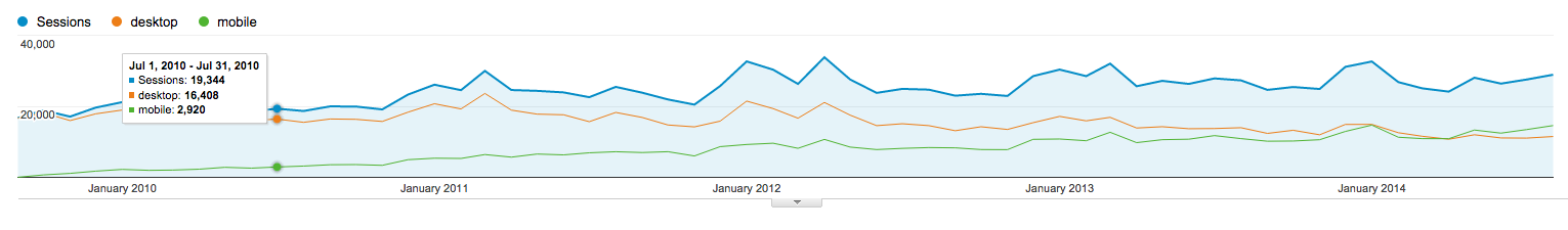
In short, mobile is continuing to trend upward. Each month when we review client analytics there is a steady trend to more and more mobile. In some cases mobile site consumption has actually surpassed desktop. Looking at the chart below we can see the last 5 years of analytics for mikunishis.com. The orange line represents desktop traffic and the green line mobile. Notice that the green line trends slowly upwards over the 5 year time span while desktop traffic trends downwards. A few months ago mobile overtook desktop for monthly site traffic.
This is where we are, mobile is slowly but surely overtaking site traffic for the majority of our customers. While it’s taken years to get where we are the evidence is obvious, mobile is here to stay; more than that, mobile is here to lead the way.
“Mobile First” mentality
In some cases, like Mikuni, it is important to take a mobile-first look at your web and email platforms. Historically web development begins with a desktop version. A specific mobile version would then be added as necessary. Current trends move towards a responsive model. The responsive model is designed to have one template work for all device sizes, without the need to manage separate content and templates.
The mobile-first approach turns traditional web development on it’s head and begins the process with the mobile solution. Considering a site like Mikuni where ~60% of the traffic is mobile it is important to start with your mobile goals.
Responsive vs mobile site
Years ago the going trend was to create a “mobile site”. A separate site sometimes held in a subdomain such as m.domain.com or mobile.domain.com or in it’s own directory such as domain.com/m. This trend has, mostly, gone the way of the dinosaur. In some cases it is still necessary to take this tactic, however, the vast majority of sites are better relying on responsive technology.
Responsive technology (really just good HTML and CSS with a modern browser) allows content to conform to the users page size. This is nice because it means you should have one place to go for all your content entry and users get a similar experience as they transition from device to device. It also helps standardize some elements, like off-canvas navigation and title bars. Users become accustomed to certain navigation trends and we can leverage those to make the transition from device to device even easier.
Why it’s important
The trends and lessons from Mikuni’s traffic are important for all of us to better understand what our users are doing and what information we need to share with them. Knowing what devices your users are visiting your site on is critical to understanding how much, or little, time needs to be put into a mobile solution. As an example, the Three29.com site only pulls about 7% mobile traffic. This makes sense, most people don’t research a firm like ours on their phone, they do it at work, on a desktop. While our site is responsive (as it should be) we didn’t spend 50% of our time on our mobile solution, we spent about 15%. We focused on developing an engaging solution to our target demographic, desktop users.
Looking for more information on responsive design & development? Here are a few other articles worth reading.
Wikipedia: http://en.wikipedia.org/wiki/Responsive_web_design
Adobe: http://www.adobe.com/devnet/html5/articles/ten-things-you-need-to-know-about-responsive-design.html
A List Apart: http://alistapart.com/column/what-we-mean-when-we-say-responsive