
How to address common logo file mistakes and build a logo that is easy to use, transparent, and unable to be edited.
I run into this all the time. A logo with a white shape used to mask another color. A font that’s missing. An unmanageable, complex grouping system. A stroke that doesn’t scale.
These are the mistakes made to logo files that designers have spent hours on that will eventually degrade the work, or generally, cause issues for the future designers and people that work with the logo. Someone’s nephew that doesn’t know what they’re doing could accidentally ruin your logo.
This blog will teach you how to prevent that.
There are three key things you need to achieve when turning over a version of the logo/logo file that is client-ready.
- The logo is simple to use.
- It uses transparency and white where appropriate.
- It is locked and not easily manipulated.
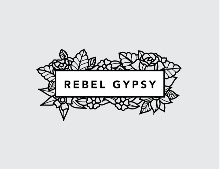
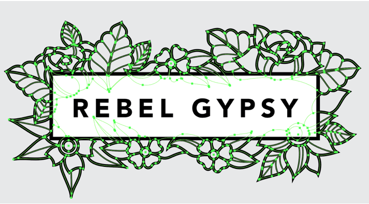
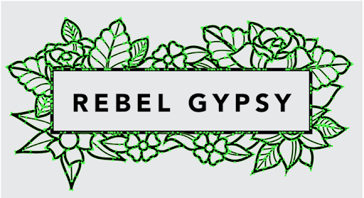
We’ll use this logo as an example, the background has been made grey to reveal where is white and where is transparent.
Before we get started:
Before you start this process you should save a logo file that has fonts and strokes intact in case you need to change something in the future. This process yields a logo that is client-facing.
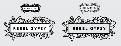
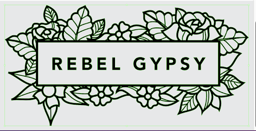
This is a before and after. The logo on the left has multiple issues, which we’ll work through. The logo on the right is built correctly.
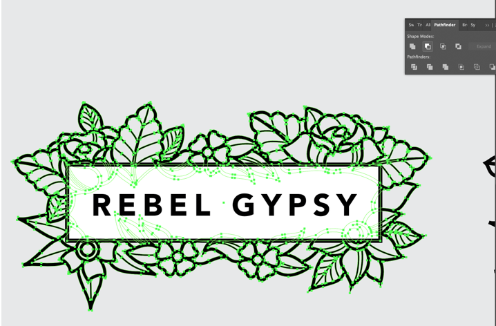
Problem: The logo uses strokes.
Solution: Expand the stroke lines and unite shapes where appropriate.
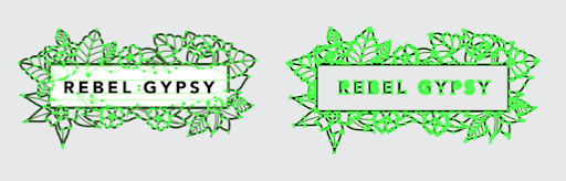
This logo uses strokes. You can tell because the vectors are on the inside of the lines (left), instead of outlining the shapes (right). So why is this an issue?
This is what happens when you scale each logo. The stroke weight stays the same on the logo on the left when the size is changed, making it crowded at small sizes, and wispy at large sizes.
To fix simply select all your stroke lines. Go to Object > Expand > Check Stroke > Hit OK.
Now your logo will have pieces and parts that represent the stroke lines, which have now been effectively turned into shape.
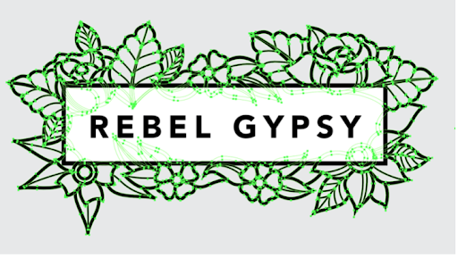
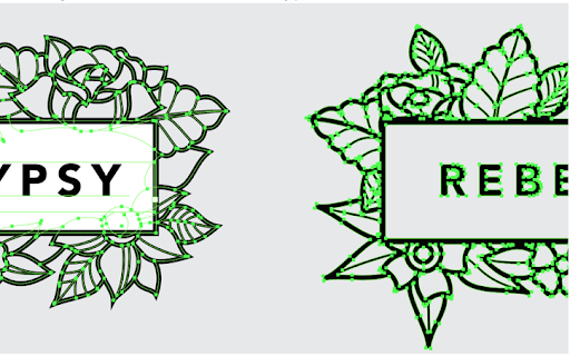
This is better, but would still allow someone to warp or distort the logo because they can unlock the elements. So let’s lock them together.
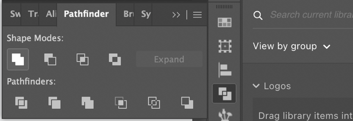
For this, you will probably need to activate the Pathfinder if it’s not already on your menu. So go to Window and select Pathfinder.
This window will appear and while you still have all the newly expanded strokes selected, hit the first
Shape mode called “Unite”. This makes one shape out of many.
Problem: The logo uses Live Type.
Solution: Expand the type.
Just one issue left… the type is still live.
Never forget to expand the type. Not everyone has the same fonts installed. To do this, select the type, right-click and select Create Outlines.

Problem: The logo is not transparent.
Solution: Differentiate between white backgrounds and transparent backgrounds.
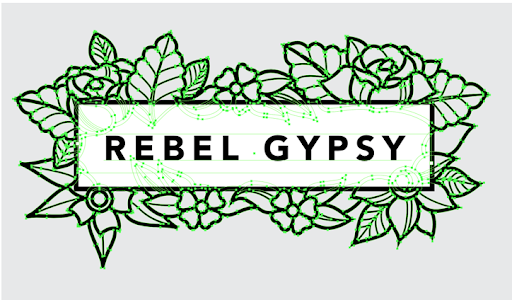
We’re getting close, but we need to address the white mask. The Box is masking off the flowers so none of the flowers touch the word mark, but unless you want the background to always be white this must be changed. Likely you will want a version that lets the background through. As it stands now, this logo would not.
You can do this a few ways, but I’m going to use the Pathfinder tool again. Select the white box and go to Object > Expand… this time check both the Fill & Stroke box, hit OK. Next, ungroup the stroke shape from the fill shape. Right-click, go to Ungroup.
Select the white shape and the flowers and go back to the Pathfinder Tool. This time you’ll use the second from left Shape Mode called “Minus Front” this does exactly what it sounds like it will do. It subtracts the front shape from the back shape.
Now you have a truly transparent logo. All colors of the same shade, that are touching, should be made into one shape so they can’t be moved independent of each other.
Here we need to Unite the black outline and the flowers. Select both shapes, go back to the Pathfinder Tool, and hit “Unite” (the first Shape Mode option).
Problem: The elements of the logo are not locked together.
Solution: Group the logo elements together.
Now, all you need to do is group the logo. This is a small step, but it’s crucial. As it stands now, if I click and drag the logo the type and border will be separated.
Select all elements of the logo, right-click, and go down to Group.
Now you have a logo that can’t be edited and will, overall, be extremely easy to work with!