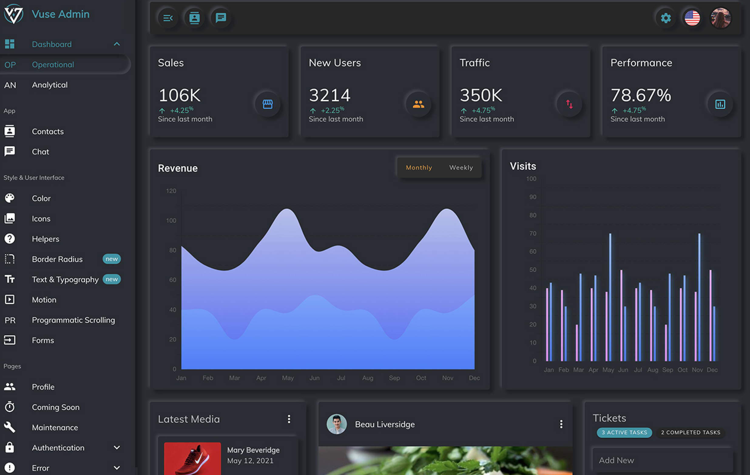
Keeping up with web design trends is a wonderful way to soak in all the different types of creative solutions possible for any project. It allows you to explore all the creative options out there and makes you feel connected to an inspired design community.
It’s a way for us creative thinkers to move forward, inspire each other, and exercise our own creative abilities. Here are some of the most popular web design trends I’ve seen so far in 2021!
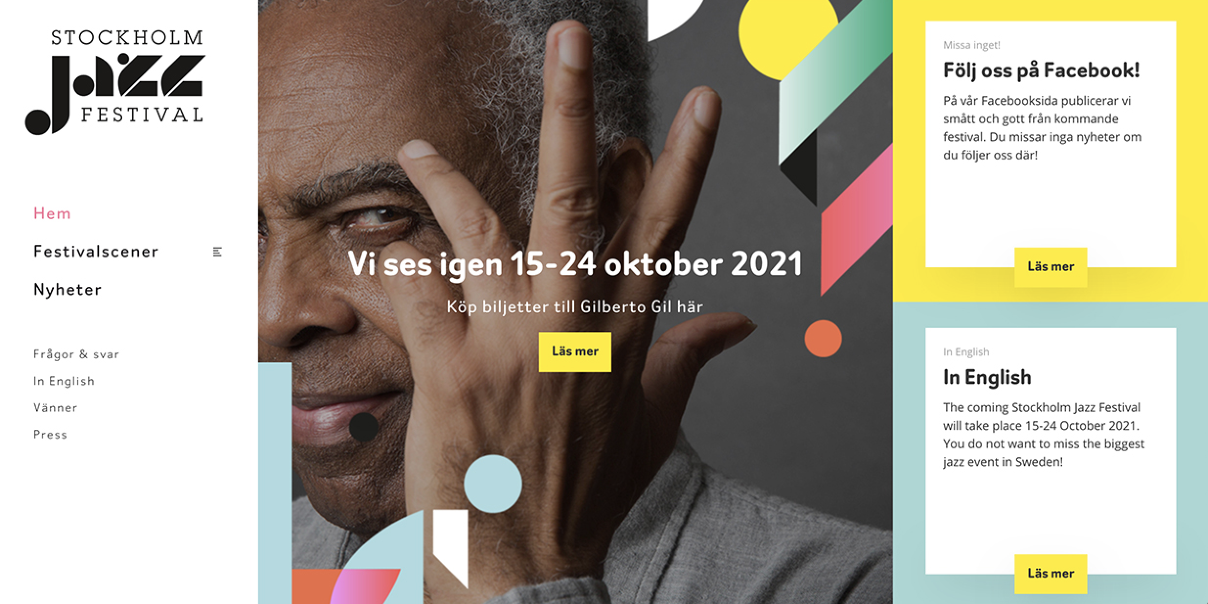
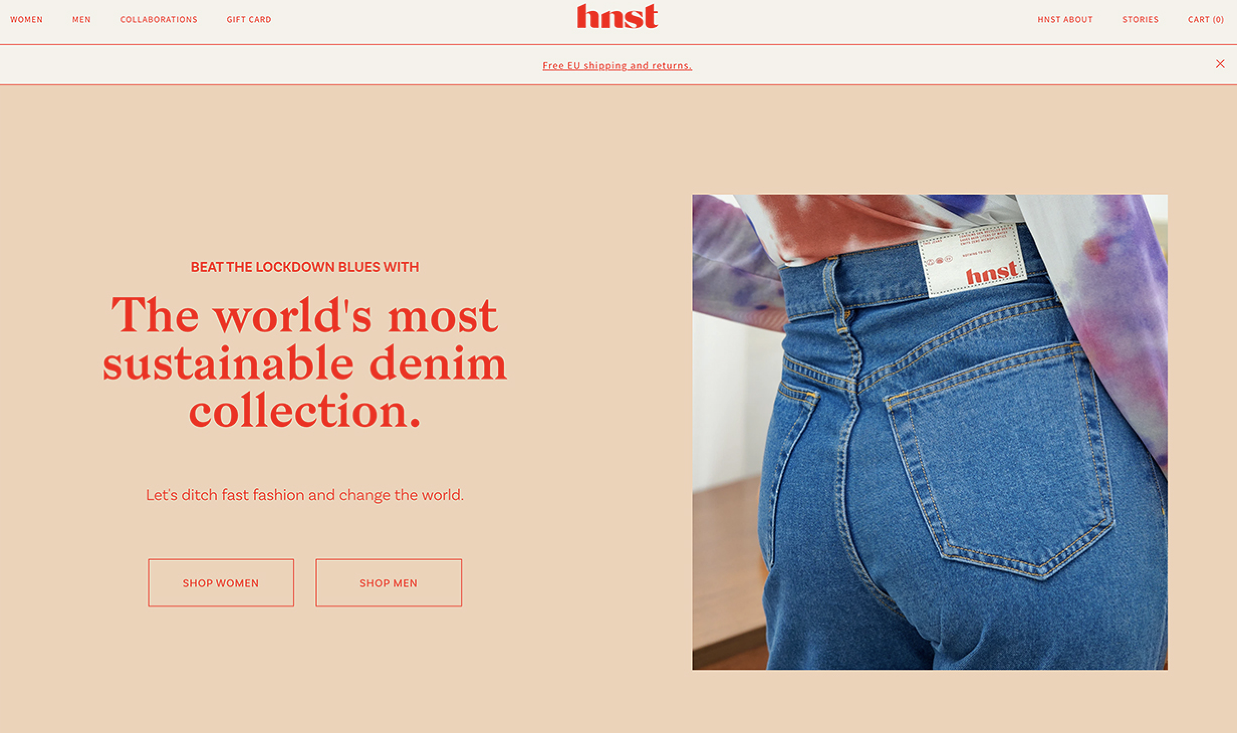
Surrealism
For fashion or high-end brands, you see web designers gaining a lot of influence from fantastical scenes and dream-like worlds to tell unique stories about the product while heightening its value.
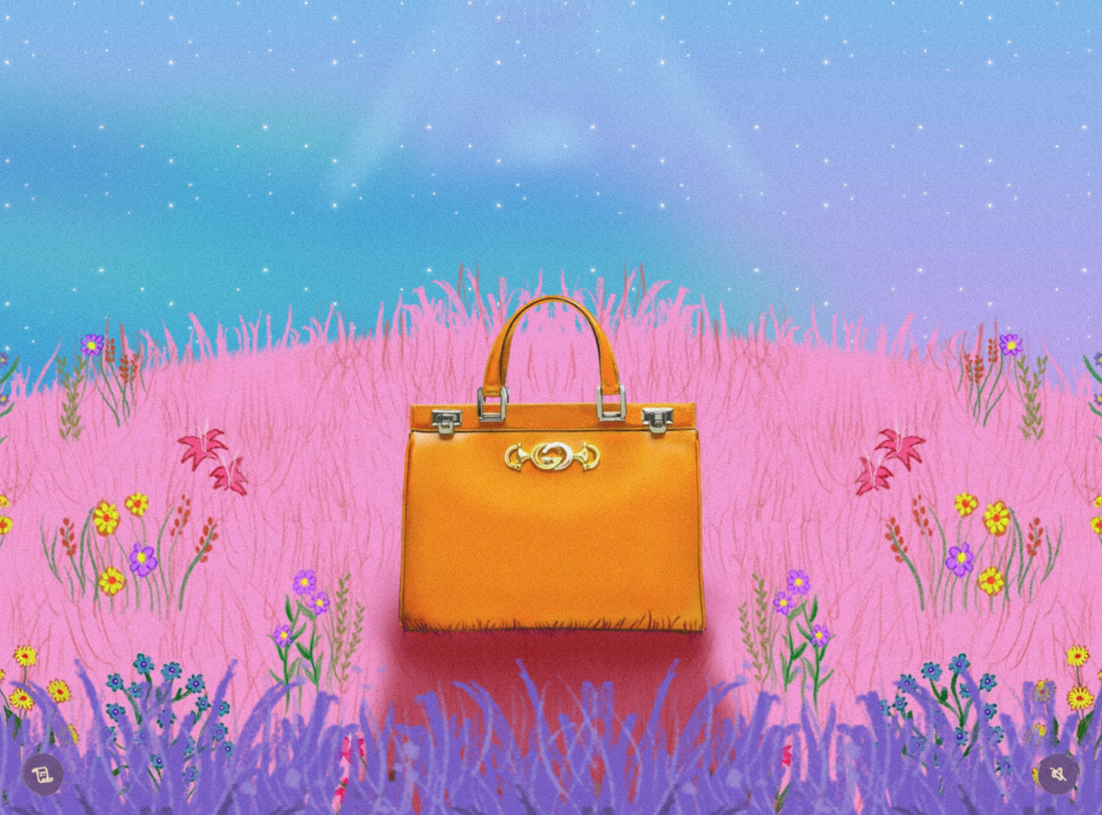
Gucci uses colorful scenery to draw attention to their unique line of purses, as well as to create a story that sparks the user’s imagination on how they can bring this sense of luxury or fantasy to their life.
Parallax Effects
This effect is simply the faster movement of foreground objects in comparison to the background. It mimics how we view things in the real world, for example, when we are driving on the road and see the trees moving past quickly but the mountains look as if they are moving a lot slower.
When used in web design, it is a great way to transform something that is relatively flat on a screen to something that feels more like a performance. It enhances user interactivity and immerses them into the design through the moving parts.
This is a great way to create a world for the subject of the site to live in and allows the user to connect with the brand. The animations also emphasize the visuals and main message of the website in a thoughtful way that is familiar and more human.
Neumorphism
Neumorphism, also known as soft UI, is a visual style that combines background colors, shapes, gradients, highlights, and shadows to add realistic touches to buttons and switches on apps.
This style was formed after Skeuomorphism—a digital style heavily used in the 2010s that featured very accurate visual representations of their real-life counterpart (example: a watch icon that looks detailed like a watch).
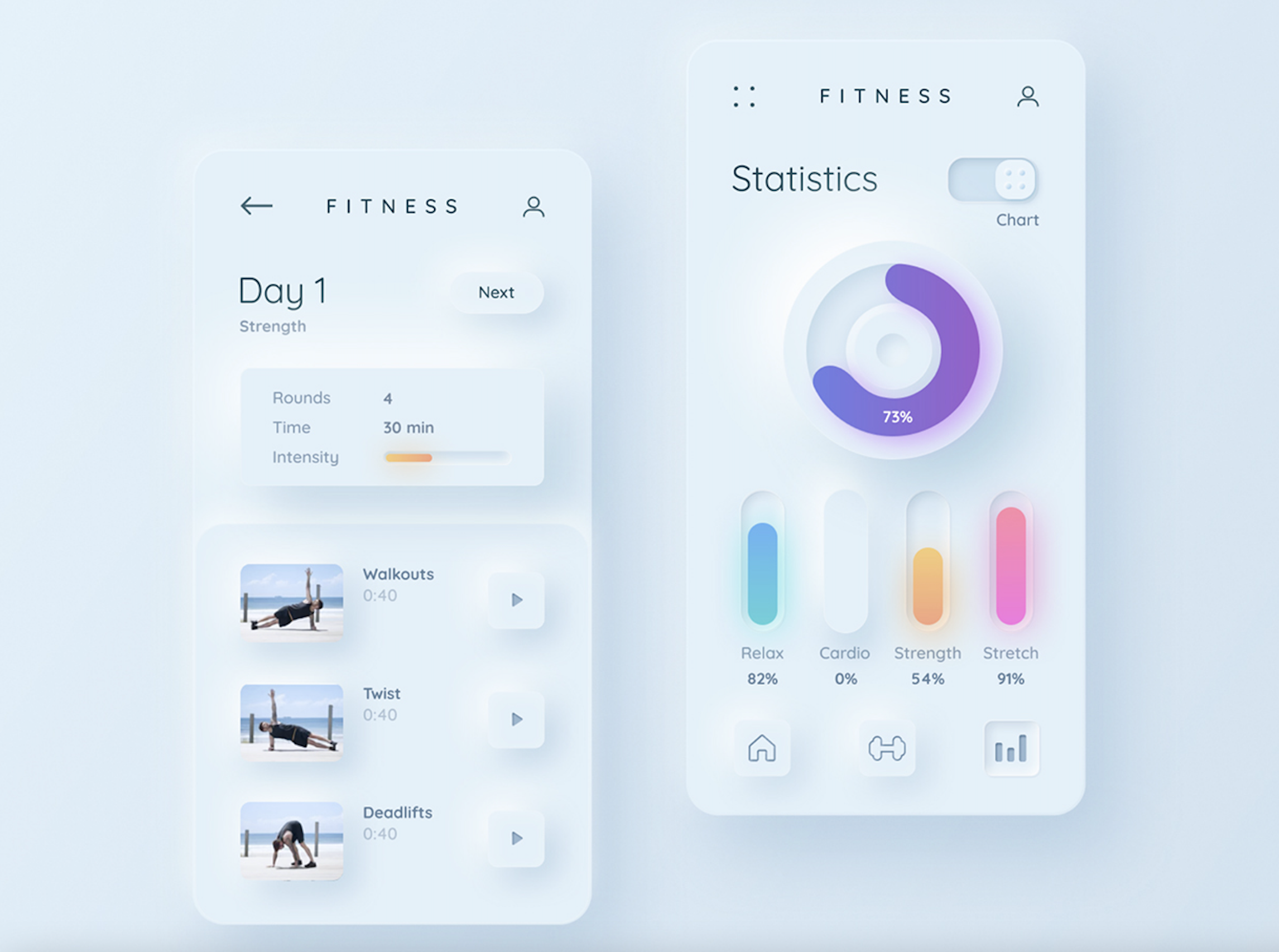
This is a great middle ground between extremely flat designs and very detailed ones. The simplicity but subtle 3D effect meshes the two different extremes to create engaging designs using depth as an illusion to entice users to interact with apps.
These features achieve a soft, extruded plastic look that is reminiscent of embossing or debossing. The combination of traditional printing roots and detailed 3D replications results in a modernized method of enticing the user to engage with the design.
Abstract Art Compositions
Abstract art compositions are a great way to express emotion, tones, and feelings of the brand without using stock photo imagery or illustrations.

Photos can also be integrated within the compositions to give more emotional context to an image. This heightens the user experience on a personal level where you can dictate the kinds of feelings you want the users to associate with your website.
How do you want your audience to feel towards your brand and what kind of impression do you want to make?
Blending artistic elements and photos expands on the nuances of design and how you can connect to the user on a psychological level to then get your points across.
Comfortable Colors
More web designers are starting to explore more with subtle pastel color schemes for websites. These softer colors enhance the tone of the brand story and the feelings users associate with the brand.
In comparison to stark color schemes, these softer tones are easier on the eyes for the user for longer periods of time. Research has shown that when sites use “comfortable colors”, it makes the site more pleasing to look at and keep users on the page longer.
By steering away from bright colors, blacks, and whites, unique color schemes can be used to bring attention to the images and content on a page.
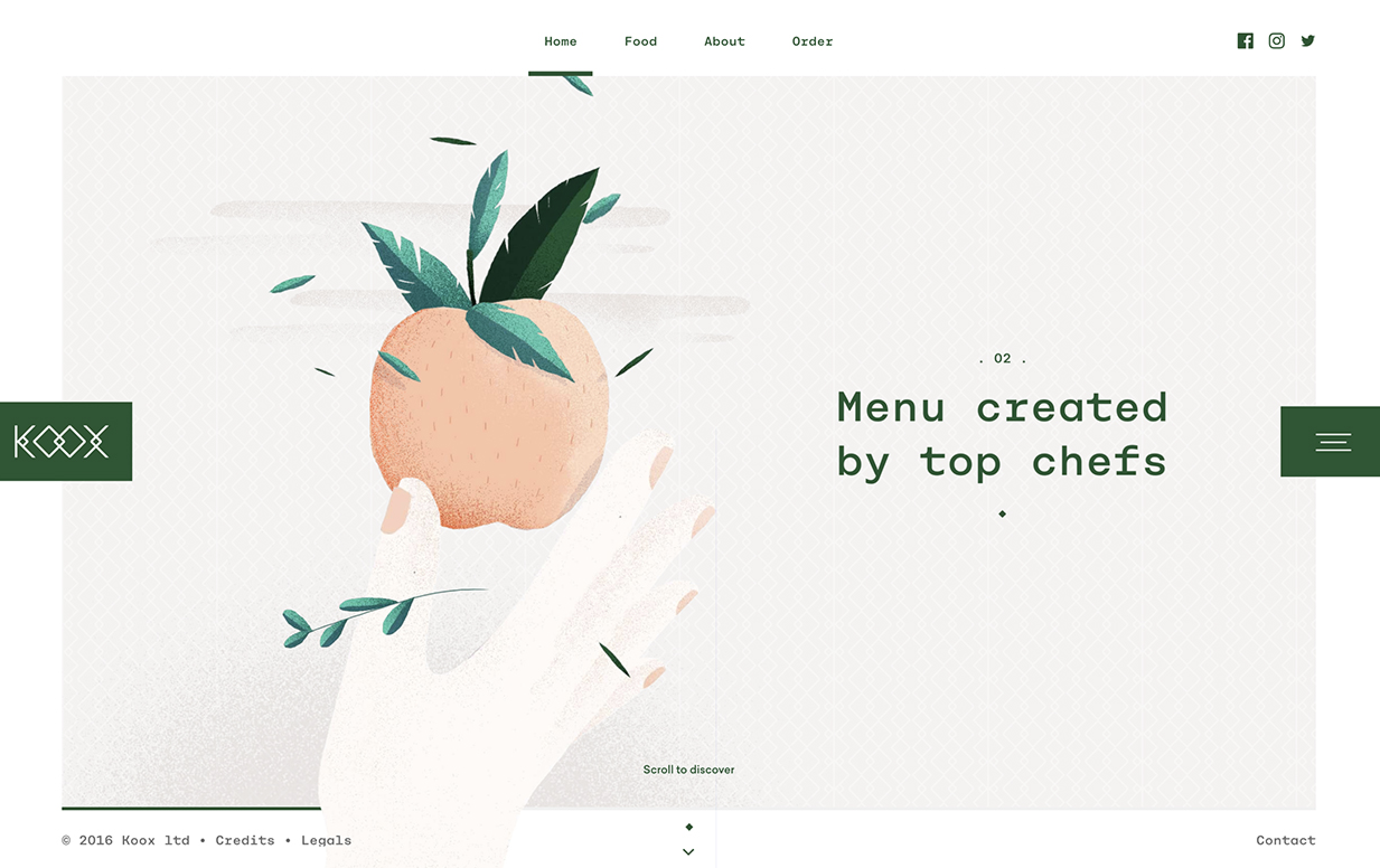
For example, with the KOOX site, the soft tan color emphasizes the dark green text and acts as a supporting color along with the illustration to create a relaxed, graceful, and light feeling that promotes the healthy and time-saving lifestyle the brand is supporting.
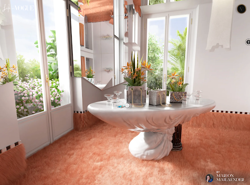
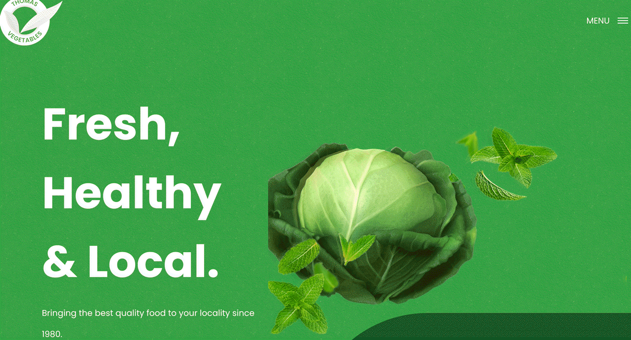
Use of Gradients / Three Dimensional Colors
Gradients are a popular design trend that has been around for quite some time but the techniques used are leaning more into a realistic way of presenting it.
Designers are being more creative with the use of gradients in colorful backgrounds to create life-like objects and scenery for visual impact.

Objects are colored with gradients in a way that creates an illusion of it popping out of the screen, allowing you to reach out and grab it. This adds a playfulness and sense of excitement to the overall design that attracts the user to continue interacting with the website/app.

Along with the playful side of gradients, it can be used to create abstract objects or scenes to create a mixture of real-life and fantasy.
These techniques can bring in the human characteristics into web designs so it feels more personal and allows users to connect with the designs while also creating new interactive experiences that will engage their interests and curiosity.
Web design trends are very important to follow as a web designer because it allows you to look outside the box and see how fellow creators are approaching design solutions. It exercises your mind to the different visual possibilities to achieve a purposeful and result-driven design.
However, one thing to take note of is to not feel constrained by these trends. Based on your client’s needs, company goals, mission, and values decide which trends will support that message and which trends will not. Use trends as inspiration and not guidelines for designs in order to keep up with the times.
What matters most is caring for the client’s design needs and how to use your knowledge set to create a masterpiece that will bring in the best results!