The SaaS market is highly competitive, but your website is more than a digital business card.
It’s often your best opportunity to explain the product, demonstrate its value, and generate trials, demo requests, and qualified leads.
What do high-converting SaaS websites do differently?
At Three29, we work with B2B and SaaS brands to transform their digital presence, and we’ve seen how certain strategies outperform others.
Whether you’re redesigning the entire site or looking for focused improvements, these SaaS website best practices can help turn more of the right visitors into potential customers.
1. Start With Clarity, Not Cleverness
The strongest SaaS websites don’t make visitors decode abstract headlines or product jargon. They communicate the essentials quickly:
- What does the software do?
- Who is it for?
- What problem or process does it improve?
- Why should the visitor believe it is a credible option?
Effective SaaS website design uses a clear headline, supporting copy, and a relevant product visual to establish this context.
Product screenshots, short videos, animations, or diagrams can help buyers understand software that would otherwise be difficult to explain.
Avoid relying on phrases such as “transform your workflow” or “unlock innovation” without explaining the actual product and outcome.
Benefits matter, but visitors also need enough concrete information to determine whether the platform fits their needs.
Social proof near the opening message—such as customer logos, specific results, recognizable integrations, or a relevant testimonial—can reinforce the value proposition without competing with it.
2. Streamline the SaaS Buyer Journey
Many SaaS websites create option overload. They give every page, navigation item, and call to action equal weight, leaving visitors unsure where to go next.
High-converting SaaS websites organize the journey around buyer needs and readiness.
A first-time visitor may need a clear overview and use-case information. A technical evaluator may want integrations, security, implementation, or documentation.
A decision-maker may look for pricing, customer results, and a demo.
SaaS conversion optimization often depends on reducing unnecessary friction:
- Give each page a clear primary purpose
- Use navigation labels buyers immediately understand
- Keep forms proportional to the value of the offer
- Reveal detailed information as buyers need it
- Connect feature, use-case, industry, integration, pricing, and proof pages logically
The goal is not always to offer fewer choices. It is to make the most relevant next step easier to recognize.
3. Use Strategic, Contextual Calls to Action
Not every visitor is ready to book a sales call, and not every SaaS product is best served by the same conversion path.
Calls to action should reflect the product’s business model and the information available on the page.
High-converting SaaS websites may use:
- A primary CTA such as Start Free Trial or Book a Demo on high-intent pages
- A lower-commitment CTA such as Watch the Product Tour or See It in Action within feature sections
- Relevant next steps beside testimonials, case studies, comparison content, or pricing information
- Contact options for buyers with security, integration, implementation, or procurement questions
Use specific, action-oriented language instead of generic labels such as Submit. Keep the wording consistent so visitors understand what will happen after they click.
4. Demonstrate the Product Before Signup
SaaS website design should help buyers experience the product’s value before they create an account or speak with sales. This is especially important for unfamiliar categories and products with complex workflows.
Useful product-education elements may include:
- Interface screenshots with explanatory captions
- Short workflow videos
- Interactive product tours
- Sample dashboards or reports
- Role-specific demonstrations
- Clear implementation and onboarding information
These assets can answer practical questions and reduce uncertainty. They also help internal champions explain the platform to other stakeholders involved in the decision.
5. Prepare Users for Onboarding and Activation
Great SaaS websites don’t stop at signup. They set accurate expectations and help the right users reach value after they convert.
This preparation can begin before the user logs in:
- Explain what the trial or demo includes
- Show the setup process and expected time commitment
- Identify any integrations, data, or approvals needed
- Use product tours and screenshots to preview the experience
- Send post-signup guidance focused on meaningful activation steps
The appropriate approach depends on the product.
A self-service SaaS platform may prioritize a fast signup and guided setup. A complex enterprise product may need a consultation, technical discovery, or implementation plan before access is useful.
6. Build Trust With Specific Proof and Transparency
Trust matters when buyers are comparing software, evaluating risk, and asking colleagues to support a purchase.
Useful trust signals include:
- Customer logos presented with permission
- Specific testimonials tied to a role, company, or use case
- Case studies that explain the problem, work, and result
- Review-platform ratings and relevant third-party recognition
- Security, compliance, privacy, and data-handling information
- Integration and implementation details
- Clear pricing or an explanation of how pricing is determined
Pricing transparency depends on the product and sales model.
Published plans may work well for self-service and SMB products. Enterprise platforms with variable usage, implementation, or service requirements may need custom pricing.
In either case, the website should help buyers understand what affects cost and what the next step involves.
7. Design the Site for Search, AI Discovery, and Ongoing Learning
A high-converting website can’t help buyers who never find it.
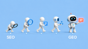
B2B SaaS website design should support traditional SEO and generative engine optimization by making the product, audience, use cases, features, integrations, and evidence easy to understand.
Build a clear page structure around the ways buyers research and evaluate the platform. Depending on the product, that may include dedicated pages for:
- Product features and capabilities
- Roles, industries, and use cases
- Integrations
- Pricing and plans
- Security and compliance
- Customer stories
- Comparisons and alternatives
- Documentation and frequently asked questions
Use descriptive headings, crawlable text, relevant internal links, accurate structured data where appropriate, and first-hand product information.
These elements help visitors navigate the site while giving search engines and AI platforms clearer context about what the company offers.
The work should continue after launch.
Track demo requests, trial starts, qualified conversions, form completion, important page paths, and downstream sales outcomes.
Use that evidence to identify which messages, pages, and conversion paths deserve further testing.
Turn SaaS Website Design Into a Growth System
The strongest SaaS websites don’t convert simply because they look polished.
They combine clear messaging, logical journeys, contextual calls to action, meaningful product education, onboarding support, credible proof, and a search-ready information structure.
Three29 provides SaaS website design and digital marketing for companies that need to explain complex products and turn more of the right visitors into demos, trials, and qualified leads.
If your site needs a complete redesign or targeted conversion improvements, contact Three29 to discuss the opportunity.